yarn add next-themes
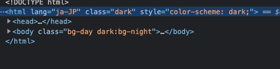
動的に制御するために class で制御するように指定
media だとOS の設定で自動で変えてくれる
const tailwindConfig = {
  darkMode: 'class',
  ...
};
ThemeProvider でも指定、デフォルトのテーマを dark にしておく(自分は dark が推しなので)
import { NextPage } from 'next';
import { ThemeProvider } from 'next-themes';
import type { AppProps } from 'next/app';

const MyApp: NextPage<AppProps> = ({ Component, pageProps }) => {
  return (
    <ThemeProvider attribute="class" defaultTheme="dark">
      <Component {...pageProps} />
    </ThemeProvider>
  );
};

export default MyApp;
どこか変えたいところで以下を設置
import { useTheme } from 'next-themes';

export const ThemeChanger: React.VFC = () => {
  const { theme, setTheme } = useTheme();

  return (
    <div>
      The current theme is: {theme}
      <button onClick={() => setTheme('light')}>Light Mode</button>
      <button onClick={() => setTheme('dark')}>Dark Mode</button>
    </div>
  );
};
↑ をアイコンつけて切り替えるようにしてみると
import { useTheme } from 'next-themes';
import { SunIcon } from '@heroicons/react/solid';
import { MoonIcon } from '@heroicons/react/solid';

export const ThemeChanger: React.VFC = () => {
  const { theme, setTheme } = useTheme();

  const handleSetTheme = () => {
    setTheme(theme === 'light' ? 'dark' : 'light');
  };

  return (
    <div>
      The current theme is: {theme}
      <button className="block p-1 bg-black dark:bg-white rounded-full" onClick={handleSetTheme}>
        {theme === 'light' ? <MoonIcon className="w-5 h-5 text-white" /> : <SunIcon className="w-5 h-5 text-black" />}
      </button>
    </div>
  );
};
こんな感じあっという間に実装できてしまいました!!
LocalStorage に theme を保存しておいて、更新したら反映させてそこをもとに class が dark になったらり light になったりとしており、そこをもとに Tailwind CSS は dark:~ のスタイルがあたる形になってるかなと!